.png)
Case Study:
Desiging a Website for a Musician
As part of the Google UX Design course, I was given a conceptual challenge:
"Design a desktop website for a musician that allows fans to easily browse upcoming shows and buy tickets online."
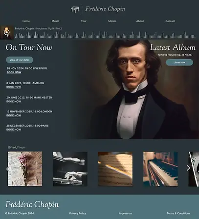
To make things simple, I chose one of my favourite composers Frederic Chopin, imagining he was alive and touring today.
At first, it seemed like a straightforward task but I quickly realised how much clarity and structure were needed to guide fans from homepage to “buy ticket” with minimal friction.
Role: UX Designer
Tools: Figma
Goals
1
Help users find tour dates and locations quickly
2
Create a ticket purchase flow from homepage to checkout
3
Reflect the musician's vibe and create excitement for the live concert
4
Create an easy, user friendly and delightful experience
01. Understanding the user

For the first stage in the process, I wanted to get in touch with my potential users. I conducted user interviews asking about participants' experiences in booking live music concerts online. I gathered notes on typical frustrations and expectations. I created user personas to develop empathy.
Based on this, I defined the following user needs:
-
The website could have many visitors at once and therefore may need to place people in a virtual queuing system for purchasing tickets and avoid crashing.
-
The website needs to be easy to understand for older generations (not overly stylised, meeting learned user expectations).
-
No hidden or unexpected add-on fees.
-
The website should add to the excitement of purchasing a ticket for a concert, should include pictures of previous concerts and reflect the vibe of the musician.
02. Structuring the Site

The next step was to create a sitemap for the main user flow, from homepage to order confirmation.
I added an additional checkout flow for users who only want to purchase merch. The user can skip to the basket overview via the Merch (shop) section, then they would have the choice to go back to browse tour dates or continue to checkout.
03. Wireframes


After a competitor audit, ideating and sketching out some paper wireframes, I combined my favourite elements of the wireframes into digital wireframes.
I wanted it to be immediately clear to the user that the artist is on tour now, and that they can look at different tour dates or immediately book. So I made sure this information appears above the fold.
I then linked up the initial wireframes and created a working prototype for user testing.
04. Usability Testing & Insights
After building my low-fidelity prototype in Figma, I ran a moderated usability study with five participants remotely. The goal was to understand whether users could easily find tour information and purchase tickets, and to uncover any friction points before developing high-fidelity designs.
Research Questions:
-
How long does it take users to find and buy a ticket?
-
Are there parts of the journey where users get stuck?
-
Is the site easy to navigate and understand?
-
What features might be missing?
What I Measured:
-
Time on task: users completed the task of ordering a ticket easily and quickly.
-
User errors or hesitations: there was slight hesitation before completing order because user felt that refund information was missing.
-
System Usability Scale (SUS): Scored highly
-
Qualitative feedback: Notes collected on clarity, structure, and expectations
Rhiannon
It was easy to find the ticket section.
Ali
I’d expect to see more payment options.
Hannah
05. High-Fidelity Prototype
Based on the initial user testing, I added more payment methods and provided clearer information about refunds.
The final prototype was a simple but structured site that allowed fans to:
-
Navigate from homepage to ticket in basket within 2–3 clicks
-
Get key tour information without scrolling endlessly
-
Enjoy the experience of being on the website with the built-in audio player
-
Preview their seat view before booking tickets
See the prototype in Figma here.
Reflection
This project helped me strengthen my foundation in creating a desktop website design and creating animations within Figma, such as the loading circle spinner and seat selector. l also learnt how to create a checkout flow for ticket purchasing. My next steps in this project would be to create a responsive design for mobile and other devices, and further user testing and refinement to meet accessibility standards.